


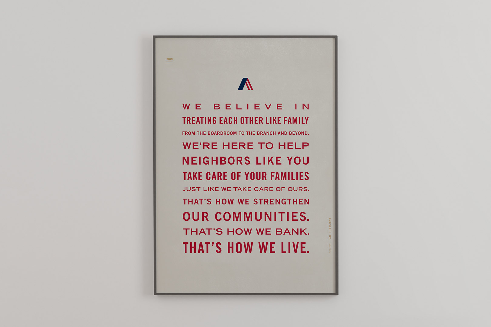
Say hello to the new look of Armstrong Bank. We like to think of it as an evolution of our brand that will allow us to serve you better. While we’ve updated our look, the people, the values, and the spirit behind our bank are still rock solid. In fact, we’re more of a family than ever.
We’re still committed to serving our customers, investing in our communities, and helping each other along the way as only family can. That will never change.
Because we always want to be an easy, reliable, and recognizable resource for you, whether you’re engaging with us by computer or phone, in-person, or out in the community.
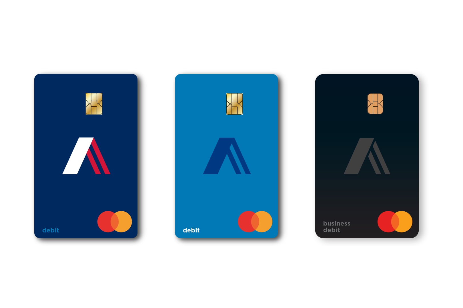
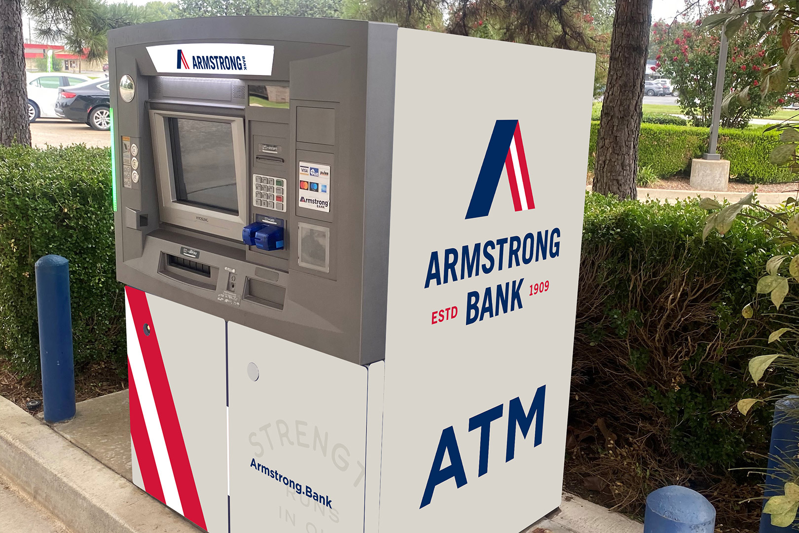
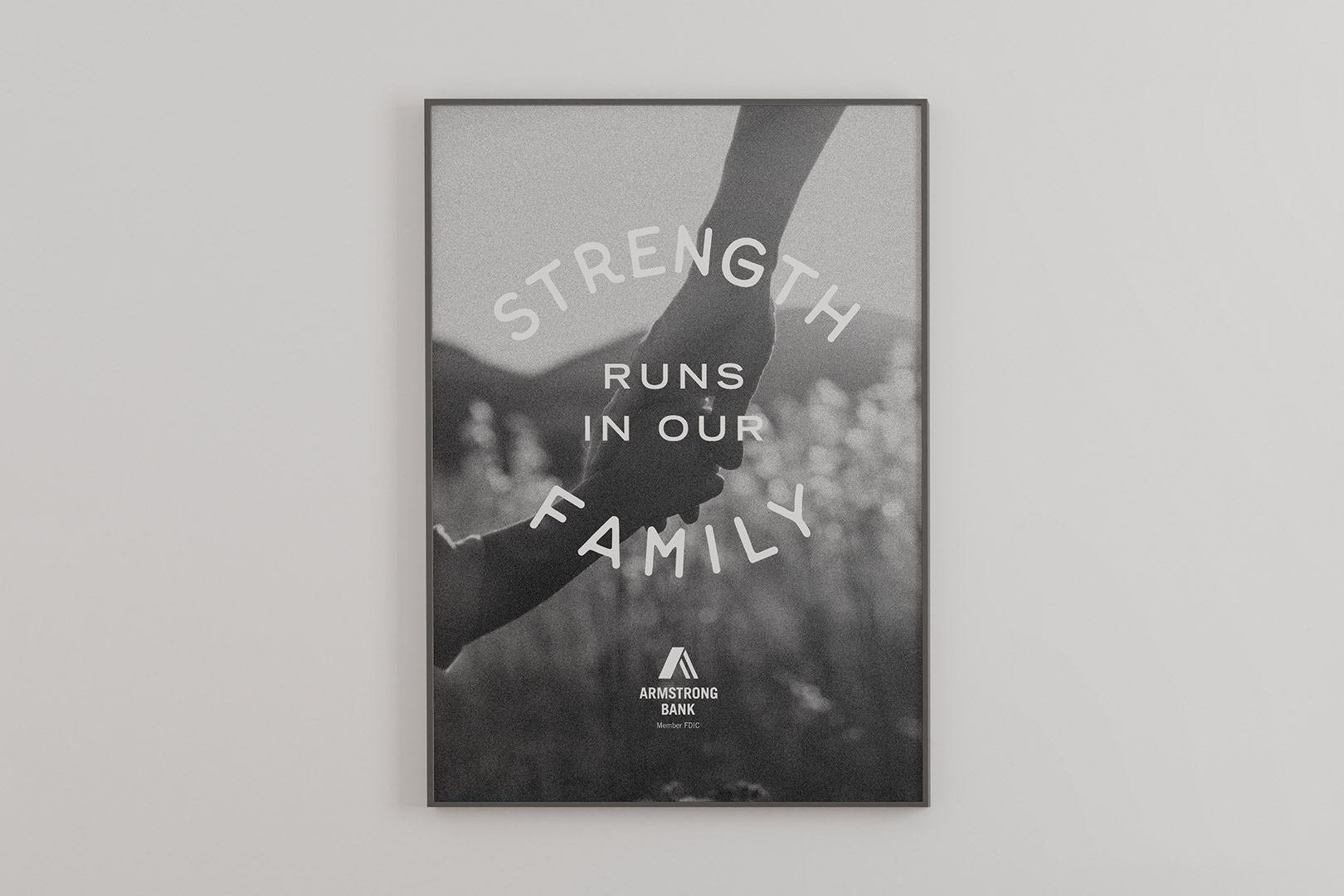
Our new logo represents the two pillars of our organization: strength and family. These come together in the shape of the letter A. It’s a symbol of our commitment to help you take care of your family, just like we take care of ours.
Our new logo represents the two pillars of our organization: strength and family. These come together in the shape of the letter A. It’s a symbol of our commitment to help you take care of your family, just like we take care of ours.


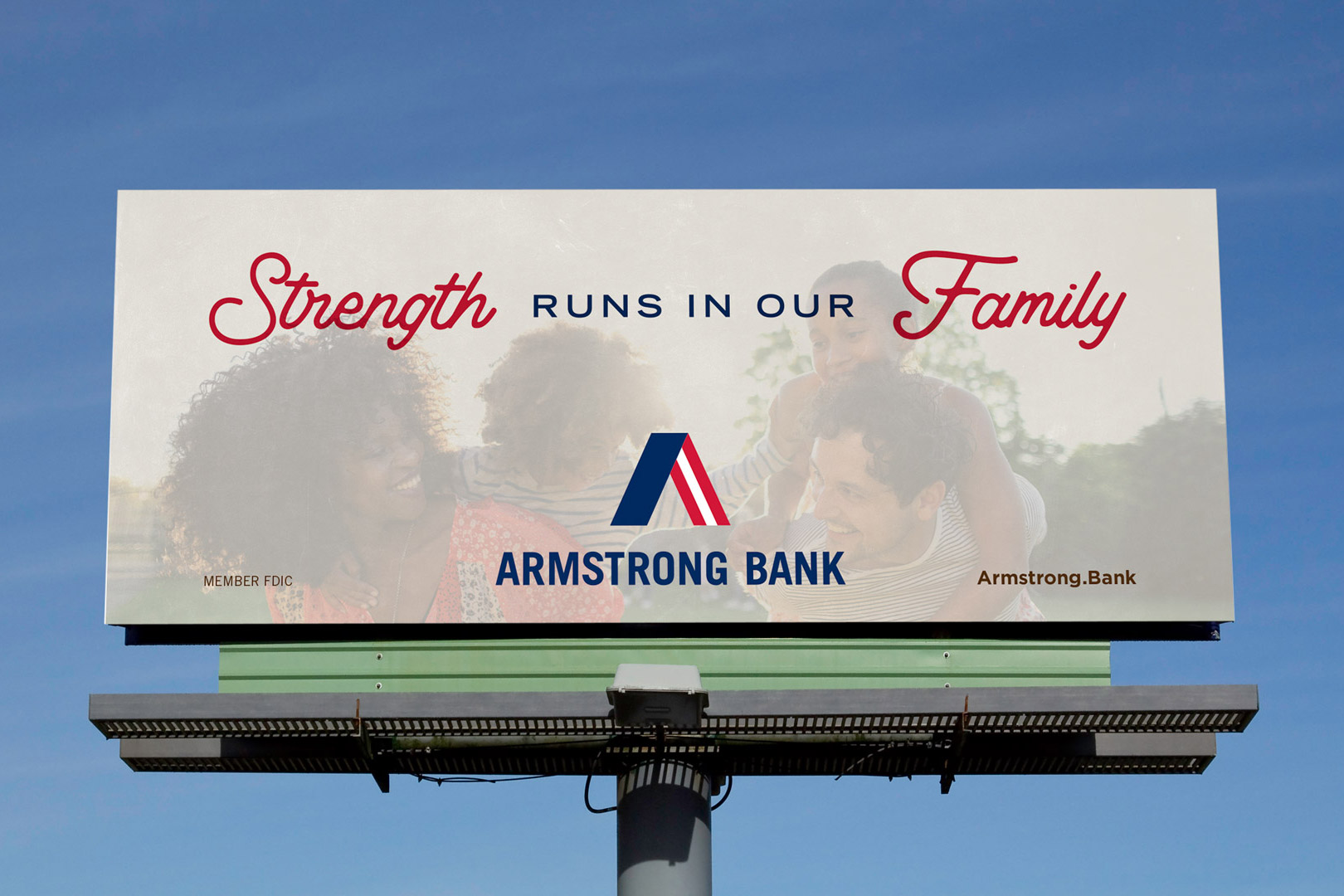
Our tagline, “Strength Runs in Our Family,” is a reminder that work and family go hand-in-hand here. When you bank here, you’re part of the family. It’s how we’ve always operated and always will.
Thanks for being
part of the
Armstrong family.